AARP Design
Roles: User Experience, Visual Design, Print Design
AARP / Shift7 Digital (formerly Siteworx)
I worked on-site at AARP in Washington, D.C. through Shift7 Digital (formerly Siteworx) from 2016 through June 2018. Acting as a jack-of-all-trades designer for the teams there, I was primarily focused on user experience, visual design, and sometimes event print design. Most of my work came from three lines of business–Editorial, Travel, and Member Benefits. While I was typically tasked with projects ranging from Homepage redesign concepts, to minor component updates in AARP's CMS, I was happy to see my designs being built daily.
AARP Travel Redesign Concept
The Travel section of the AARP.org site has long been it's own business unit with it's own goals and product strategy. Over time, it became clear that although the former can be true, the overall design of the section should be similar to that of the rest of the site to provide a cohesive user experience.
Travel home responsive concept
Travel destination landing responsive concept
Travel destination responsive concept
Travel article responsive concept
Being informed by other AARP.org redesign initiatives, I proposed a version of the site that is forward thinking, while still keeping the basic building blocks of the AARP digital design palette and styles.
Travel destination responsive concept
The business unit had always made it clear that the strategic partnerships, ads, and Expedia booking widget are among their top priorities. Not only are they important for the bottom line, a bulk of user traffic to the section includes bookings via the Expedia widget.
AARP Member Benefits Redesign
One key challenge that the Member Benefits team has faced in the past is providing AARP users with a simple and easy to use webpage that lays out all of the possible benefits an AARP member has access to. The directive was to keep the page extremely minimal, maximize the space used for the benefits list, and provide a mechanism for the user to be able to filter and search for benefits easily.
Member benefits landing page
My design allowed for a toggle between a browse by category experience, and a search by keyword experience. The dropdown for categories opens up a mega dropdown with all categories and possible sub-categories, including iconography that is also seen by default on the landing page, helping to build a visual language associated with the member benefits.
Member benefits mega dropdown
On click or tap of any benefit listing launches an offer modal overlay. The collective team decided that this experience was best for the user who is then able to quickly decide to redeem the offer, or close out the modal and continue browsing without having left the benefits landing page.
Member benefits modal
While the Member Benefits experience is always expanding and changing, you can see the current state of the product at www.aarp.org/benefits-discounts.
Digital Summit Posters
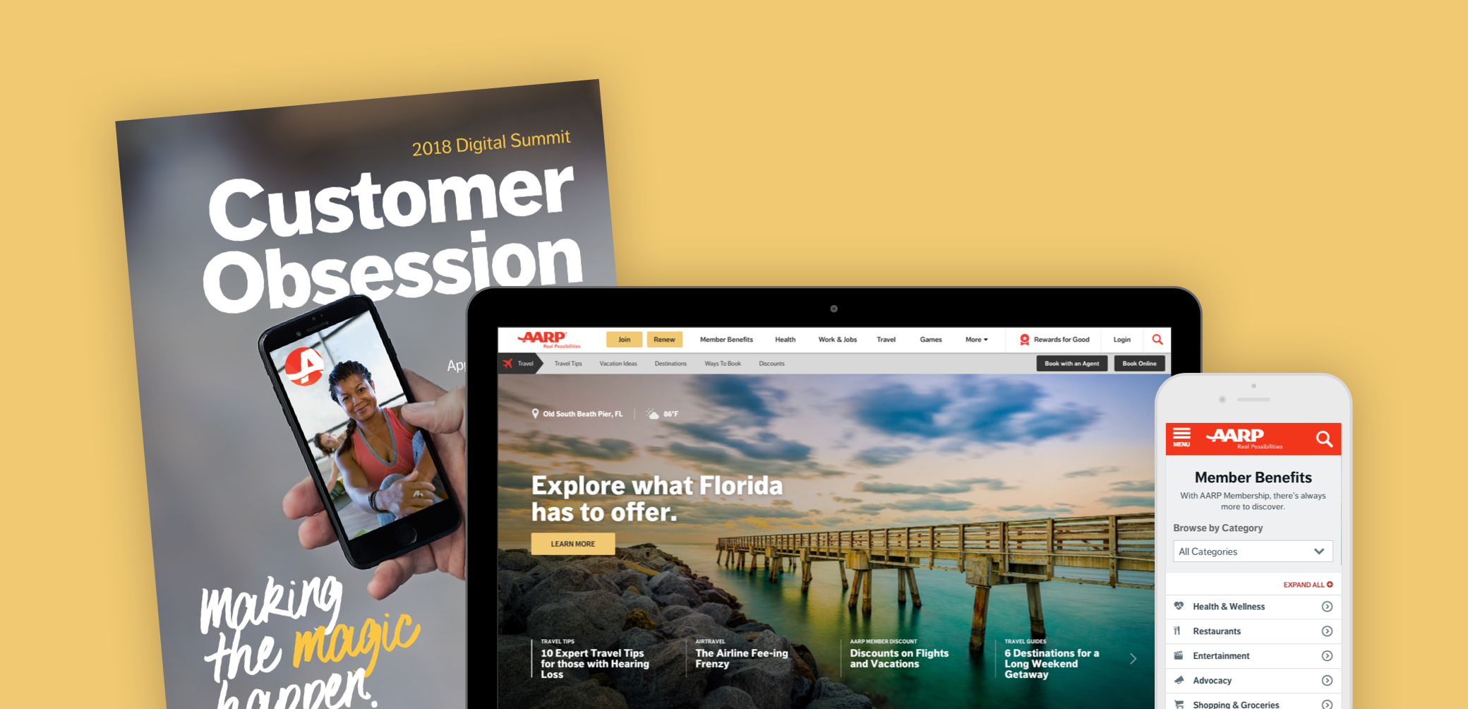
The AARP design team has usually been tapped to create eye-catching poster designs for the marketing team's annual Digital Summit. The event emphasizes the need for customer-centric marketing strategies that focus on the user's experience.
2018's tagline was "Customer Obsession"
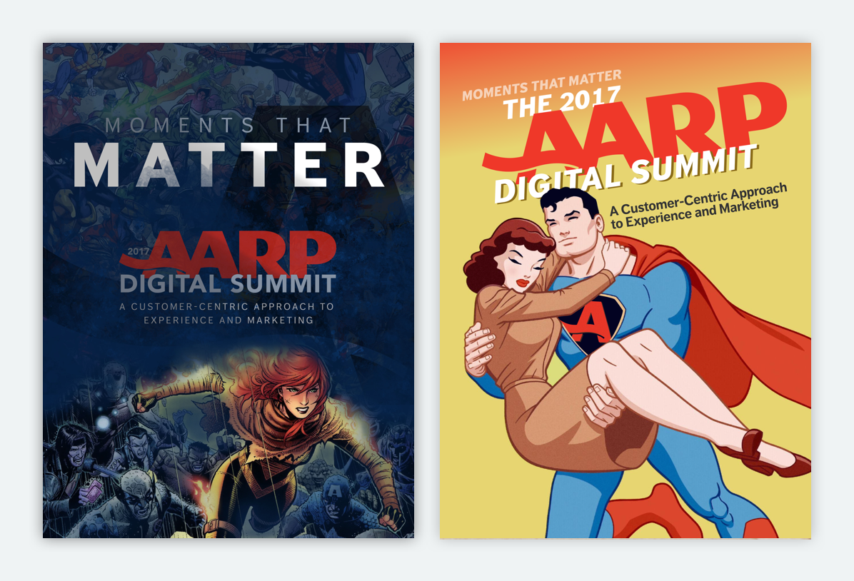
2017's tagline was "Moments that Matter"
AARP 2018 Digital Summit Poster Concepts
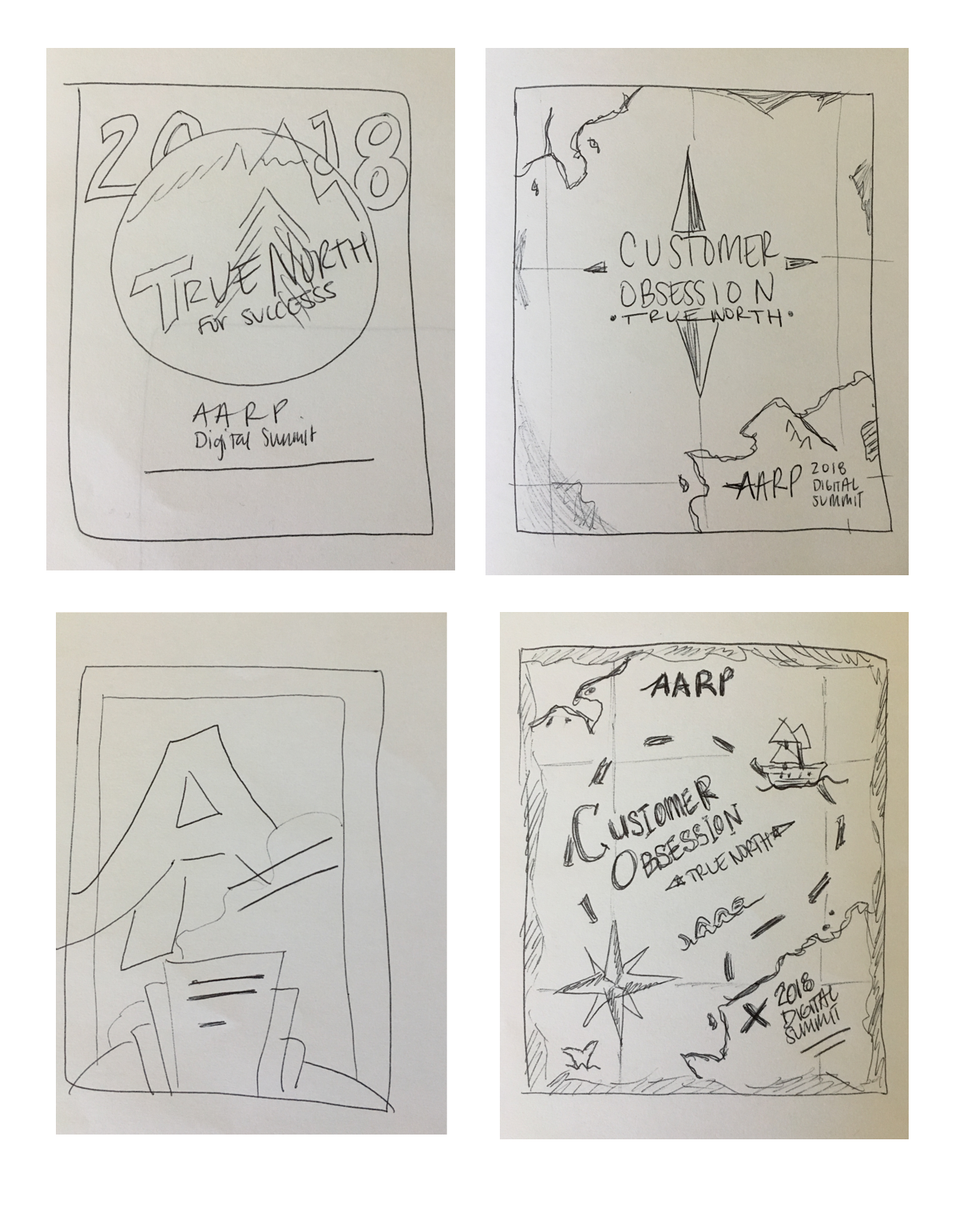
AARP 2018 Digital Summit Poster Concept Sketches
AARP 2018 Digital Summit Poster Concepts
AARP 2017 Digital Summit Poster Concepts
My 2017 poster for "Moments that Matter" was one of two posters selected for the summit that year. The poster was printed and displayed around the event.
AARP 2017 Digital Summit Poster
Resume
Dribbble Profile


